Final Draft of the digipak incorporating common values of an album and with relevance to the other ancillary products.

With the Template.

Without the template .
By Shane O'Reilly
The Digipak Developments
Final Draft of print advert
By Taro Bedeau


The above image is an experimental draft of the digipak. To attempt to make the album case ascetically pleasing we incorporated the black and white theme throughout not only the images within the panels but also the background. However feel that it is not vibrant or eye catching enough.

The above image is what GPP intend to progress with including the green to black background. We have selected this for a number of reasons. The background is not only eye catching but also incorporates the play on stereotypical Irish/ Irish rock assumptions of green for items such as the flag or general fields etc.
Within the Digipak GPP have decided to include our group logo which is situated in the top right hand corner. This helps relate to other ancillary products related to our project but also shows a clear representation.
By Shane O'Reilly
Advertisement
In my first draft I did the basics of having the artist and album name in the poster but the feedback I got was that it was too simple and not very attractive and the alignment and placement of the text should have a re-think. As well as more information on the album.

In my final draft I changed the colour of the album title to help create a clear distinct between the artist and the album title. I also included the album front cover and included places for were to but the album. I also fixed the placements of the text to make more presentable than before. I also included our production logo.
By Taro Bedeau

This is the first draft of our digipak including the dimesions provided by the template. Clearly showing the 6 panels including a front cover and a back cover. In addition it includes a track list of the official album produced by 'creeds cross'.

This is the digipak without the template showing the writing along the spine more clearly.
Amendments and Changes we will continue with :
The main changes we will produce are using our own images of the celtic cross for the back cover which we will acquire soon. Secondly we will re-shoot the images of the table scene to make it more appropriate to the mise en scene of 'irish rock'. In addition we will either replace the irish flag shot entirely or we will re shoot the flag to produce a better more suited image.
Overall our digipak will look very similar to our first draft with a few changes. Using images of scenes we have used throughout our production alongside , stereotypical Irish relations with a fading green background helps to achieve an effective and appropriate feel to the album.
By Shane O'Reilly
By Shane O'Reilly
The Making of the ancillary products
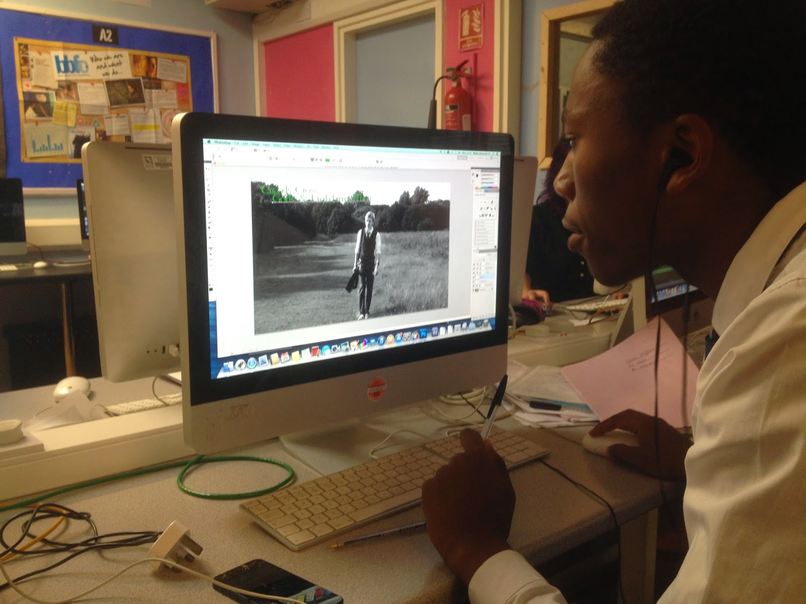
Throughout the Creation of the ancillary products both Taro and I experienced a range of new softwares, which we successfully utilised to produced an effective and aesthetically pleasing end results. Softwares we used consisted of photo shop which was a new experience and our understanding developed and evolved rendering us being able to more efficiently and effectively create our products the more we used it. With the aid of websites such as youtube we were able to self teach but we also learnt from trial and error.

Furthermore we also used Final cut pro which was a more developed editing software rather than i movie we captured crucial imagery within filming which would be used throughout our ancillaries.Throughout both of our products we have maintained a common theme in order for visual relations to be made. An example of this is the celtic writing we used as well as our production logo which clearly represents our production is present throughout both products.
By Shane O'Reilly
No comments:
Post a Comment